
Pantone reveals Color of the Year 2020:PANTONE? 19-4052 Classic Blue
2020-02-10 04:11
China Textile 2020年1期
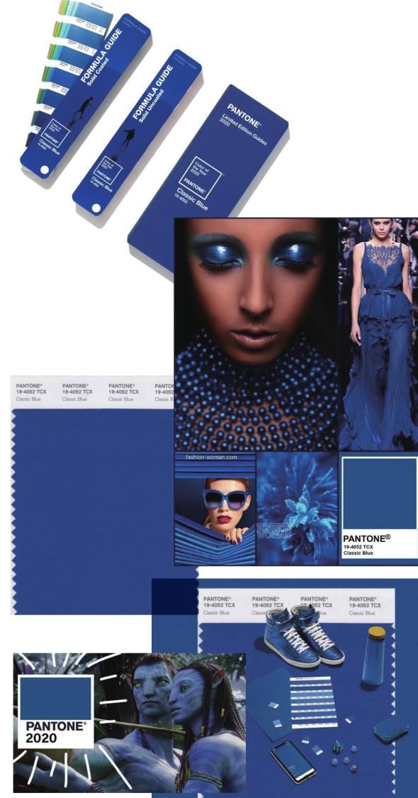
Pantone, a provider of professional color language standards and digital solutions, and X-Rite Inc. announced PANTONE 19-4052, Classic Blue, as the Pantone? Color of the Year for 2020; a timeless and enduring hue elegant in its simplicity. Suggestive of the sky at dusk, the reassuring qualities of the thoughtprovoking. PANTONE 19-4052 Classic Blue highlights our desire for a dependable and stable foundation from which to build as we cross the threshold into a new era.
“We are living in a time that requires trust and faith. It is this kind of constancy and confidence that is expressed by PANTONE 19-4052 Classic Blue, a solid and dependable blue hue we can always rely on,” said Leatrice Eiseman, executive director of the Pantone Color Institute. “Imbued with a deep resonance, PANTONE 19-4052 Classic Blue provides an anchoring foundation. A boundless blue evocative of the vast and infinite evening sky, PANTONE 19-4052 Classic Blue encourages us to look beyond the obvious to expand our thinking; challenging us to think more deeply, increase our perspective and open the flow of communication.”
Imprinted in our psyches as a restful color, PANTONE 19-4052, Classic Blue brings a sense of peace and tranquility to the human spirit, offering refuge. Aiding concentration and bringing laser-like clarity, PANTONE 19-4052, Classic Blue re-centers our thoughts. A reflective blue tone, Classic Blue fosters resilience.
As technology continues to race ahead of the human ability to process it all, it is easy to understand why we gravitate to colors that are honest and offer the promise of protection. Non-aggressive and easily relatable, the trusted PANTONE 19-4052, Classic Blue lends itself to relaxed interaction. Associated with the return of another day, this universal favorite is comfortably embraced.
“The Pantone Color of the Year highlights the relationship between trends in color and what is taking place in our global culture at a moment in time, a color that reflects what individuals feel they need that color can hope to answer.” added Laurie Pressman, vice president of the Pantone Color Institute. “As society continues to recognize color as a critical form of communication, and a way to express and affect ideas and emotions, designers and brands should feel inspired to use color to engage and connect. The Pantone Color of the Year selection provides strategic direction for the world of trend and design, reflecting the Pantone Color Institutes year-round work doing the same for designers and brands.”
To fully bring to life the true meaning of PANTONE 19-4052 Classic Blue, Pantone has translated PANTONE 19-4052 Classic Blue into a multi-sensory experience. By extending the sensory reach of PANTONE 19-4052 Classic Blue, Pantone is hoping to reach a greater diversity of people to provide everyone with an opportunity to engage with the Color of the Year 2020 in their own unique way.
“As we all head into a new era, we wanted to challenge ourselves to find inspiration from new sources that not only evolve our Color of the Year plat- form, but also help our global audiences achieve richer and more rewarding color experiences,” added Pressman. “This desire, combined with the emotional properties of PANTONE 19-4052 Classic Blue, motivated us to expand beyond the visual, to bring the 2020 Pantone Color of the Year to life through a multi-sensory experience.”
Classic Blue in fashion
PANTONE 19-4052 Classic Blue is a poised and self-assured blue hue elegant in its simplicity. Genderless in outlook and seasonless in endurance, this foundational anchor shade enables color mixes throughout the spectrum, as well as making a strong statement on its own. Emblematic of heritage but at the same time highly contemporary, versatile PANTONE 19-4052 Classic Blue takes on distinct appearances through application to different materials, finishes and textures from shimmering metallics, lustrous sheens and high-tech materials to hand crafted looks and more fragile fabrics.
Classic Blue in beauty
In the ultimate display of personal expression, PANTONE 19-4052 Classic Blue makes a dramatic statement for eyes, nails and hair in a variety of finishes from glittery and glam to dusty matte.
Classic Blue in home décor
Offering the promise of protection PANTONE 19-4052 Classic Blue is a pervasive favorite for home. Creating a stable foundation from which to build, PANTONE 19-4052 Classic Blue injects creative confidence into interiors, transforming a space through unique color combinations and tonal statements. Easily applied across so many different materials, textures and finishes, PANTONE 19-4052 Classic Blue is a dependable blue that can take you in different directions expressing tradition and elegance as well as unexpected boldness.
Classic Blue in graphic design and packaging
Because of PANTONE 19-4052 Classic Blues relation to the sky at dusk, something we see every day, it maintains a perception of dependability and constancy. A color we respond to viscerally as being trustworthy, PANTONE 19-4052 Classic Blue is an ideal shade for many applications of graphic design. This is especially true for packaging where PANTONE 19-4052 Classic Blue conveys the message of honesty, credibility and reliability that todays consumers are connecting to.
Classic Blue in food and beverage
Blue foods and beverages including PANTONE 19-4052 Classic Blue like shades are rich in anthocyanins. With this relationship to wellness and self-care these blue foods help to build a solid foundation, acting as a form of protection for good health. In addition to their natural health benefits, these blue foods also bring style and sophistication to the table.

- China Textile的其它文章
- Dear readers
- Together for the future high-quality development of the industry
- Annual review of China’s textile and apparel industry in 2019
- 2019 textile machinery industry moved forward under pressure
- China’s apparel industry calls for strengthening intellectual property protection
- Ruyi’s belief in science and technology